The Andromeda brand and how to use it.
The logo, colours, type, tone and motion behind andromeda.im. You can download the logo for press, presentations and your school’s own materials.

Logo
The logo is the mark followed by the word "andromeda" in lowercase, all in plum. Use the files as supplied and don’t redraw them.





Light and dark backgrounds
On sand or white, the logo is plum. On dark plum, it is white. Don’t place it over detailed photos.
Minimum size
On screen, the full logo is at least 24 px tall, about 107 px wide. If it doesn’t fit, use the mark alone. In print, at least 25 mm wide.
24 pxClear space
Leave at least half the mark’s height clear on every side. Use the full height where there is room.
x/2Don’ts
The mark alone
Where the full logo doesn’t fit, such as a favicon, an avatar or an app icon, use the mark alone with the same clear space.
Colour
The palette is sand, plum and magenta. Sand is the ground, dark plum is the text, and magenta marks what matters, a few times per screen.
Core colours
Each colour is a CSS token in src/index.css. Body text needs 4.5:1 contrast, and large text needs 3:1.
The ground of every page.
- Plum text
- 15.9:1 · AAA
- White text
- 1.1:1 · Decorative
- On sand
- 1.0:1 · Decorative
Bands and blocks that stand apart from the ground.
- Plum text
- 14.7:1 · AAA
- White text
- 1.2:1 · Decorative
- On sand
- 1.1:1 · Decorative
Cards, fields and screenshots.
- Plum text
- 17.1:1 · AAA
- White text
- 1.0:1 · Decorative
- On sand
- 1.1:1 · Decorative
Borders and 1 px dividers.
- Plum text
- 12.8:1 · AAA
- White text
- 1.3:1 · Decorative
- On sand
- 1.2:1 · Decorative
Headlines and main text.
- Plum text
- 1.0:1 · Decorative
- White text
- 17.1:1 · AAA
- On sand
- 15.9:1 · AAA
Paragraphs and leads.
- Plum text
- 1.9:1 · Decorative
- White text
- 9.0:1 · AAA
- On sand
- 8.4:1 · AAA
Secondary text and labels.
- Plum text
- 2.8:1 · Decorative
- White text
- 6.0:1 · AA
- On sand
- 5.6:1 · AA
Disabled text. Not for paragraphs.
- Plum text
- 6.0:1 · AA
- White text
- 2.8:1 · Decorative
- On sand
- 2.7:1 · Decorative
Links, label dots and highlighted words.
- Plum text
- 2.3:1 · Decorative
- White text
- 7.3:1 · AAA
- On sand
- 6.8:1 · AA
Icon tiles and chips.
- Plum text
- 14.0:1 · AAA
- White text
- 1.2:1 · Decorative
- On sand
- 1.1:1 · Decorative
Text on light magenta.
- Plum text
- 1.2:1 · Decorative
- White text
- 13.7:1 · AAA
- On sand
- 12.8:1 · AAA
Proportion
A page is mostly sand and white. Plum goes in the text and in at most one dark band per page. Magenta takes less than 5%.
Plum scale
The fixed brand tones, which don’t change with the theme. plum-ink is the plum of buttons and dark blocks.
Sand scale
Dark bands
The AI block, the featured pricing plan and the footer sit on plum. There, text turns white and the light magentas, plum-50 and plum-100. We never use pure black.
Messages with read receipts, approval by the leadership team before they go out and an archive of everything sent. Without relying on any teacher's personal phone number.
Typography
Inter for everything. Instrument Serif italic only for the highlighted word in a headline. JetBrains Mono only in the manifesto.
Interface, headlines and text, in weights 400, 500, 600 and 700.
Italic 400, for the highlighted part of a headline, set 8% larger than the rest.
Only in the manifesto, in weights 400 and 500.
Scale
Headlines are weight 500 with negative tracking, and they shrink with the screen width.
Highlighted headlines
Each headline has at most one highlighted part, in Instrument Serif italic and magenta. The rest is Inter.
Name and tone
How to write the name, and how Andromeda sounds.
The name
The name follows the language of the text. Lowercase appears only inside the logo.
- ANDROMEDA
- andromeda, inside a sentence
- Andrómeda, in English text
- Andromeda App
Tone
- We name what the product does: who read a notice, what still needs approval, which class needs attention.
- Concrete facts over adjectives: "15 days, no card", not "risk-free trial".
- In Spanish, Rioplatense voseo: "Empezá gratis". In Brazilian Portuguese, "você".
- Headlines are in sentence case.
- AI gives teachers back time and context. It doesn’t replace them.
Space and shape
Measurements that repeat across the site.
Container
A maximum width of 1280 px, with side margins of 24 px on phones, 40 px on tablets and 56 px on desktop. Sections are 96 to 144 px apart.
Corner radius
Buttons
There are three buttons, all pill-shaped: the primary one in plum, the secondary one in white with a border, and a white one for dark backgrounds. On hover they change tone, and on press they shrink by 2%.
Icons
Icons come from Lucide, with a 2 px stroke. They are 16 px inside text and 20 px in buttons and cards. Inside a tile, they sit on light magenta.
Imagery
We show real screenshots of the admin panel and the app, in the reader’s language. No mockups and no stock photos.
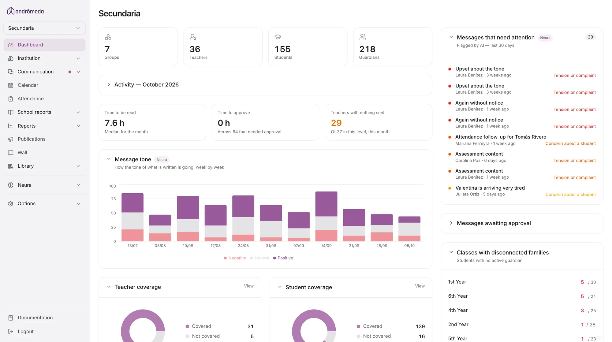
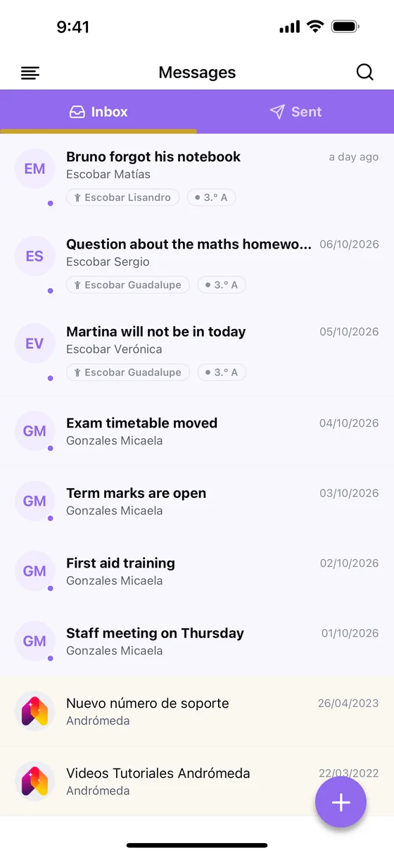
- There is one screenshot per language, with the suffix -es, -pt or -en.
- They are .webp, with width and height, and lazy-loaded.
- On sand or white, with a 1 px border and 24 px corners.
Motion
Everything enters on the same curve, fast at the start and soft at the end. When the device asks for reduced motion, the fade stays and the movement goes.
Curve
Durations
Entrances
Blocks rise 18 px and go from a 6 px blur to sharp. Headlines enter word by word, one every 45 ms.